
When building an interactive website or web app, the smallest details can make a huge impact on how users engage with your content. As a full-stack developer with over a decade of experience and a WordPress expert, I’ve spent countless hours refining these details to create intuitive and engaging user experiences.
Three essential UI elements that frequently enhance user interaction are tooltips, popovers, and modals. While they might appear similar at first glance, each plays a distinct role in improving the overall user experience. From crafting custom WordPress themes to developing complex plugins, I’ve come to understand the significance of these elements. Let’s break down their differences and explore how to use them effectively.
Tooltip vs Popover vs Modal: Key Differences
Here’s a quick overview to get started:
| Feature | Tooltip | Popover | Modal |
|---|---|---|---|
| Trigger | Hover or focus | Click or custom trigger | Click or critical action |
| Visibility | Disappears quickly | Visible until dismissed | Blocks interaction until resolved |
| Content | Brief text | Rich (forms, buttons) | Critical info (alerts, forms) |
| User Interaction | None needed | Allows interaction | Requires action |
| Best For | Hints, minimal information | Complex content or options | Important, focused actions |
Tooltip: Subtle and Informative

A tooltip is your best friend when you need to provide quick, unobtrusive hints. In my own projects, especially while building feature-rich WordPress themes, tooltips have been essential for reducing clutter and guiding users without overwhelming them.
Key Features:
- Appearance: A small, concise text box.
- Trigger: Activated by hover or focus.
- Content: Short, informative text or hints (e.g., definitions, descriptions).
When to Use Tooltips:
Tooltips are perfect for:
- Clarifying the purpose of icons or buttons.
- Adding definitions to complex terms without disrupting the user flow.
- Helping new users navigate your site intuitively.
Example:
Hovering over an unfamiliar icon in a settings menu could reveal a tooltip: “Click to access advanced options.”
Popover: Rich, Interactive Content

Popovers are like tooltips’ bigger, more interactive sibling. Over the years, I’ve used popovers extensively for creating user-friendly admin panels and dynamic interfaces in WordPress. They’re invaluable for providing deeper insights or enabling quick interactions.
Key Features:
- Appearance: Larger than a tooltip, often with text, buttons, or form fields.
- Trigger: Activated by clicking or other user actions.
- Content: Can include rich content like links, forms, buttons, or detailed explanations.
When to Use Popovers:
From adding product filters to creating editable forms, popovers shine when:
- You need to display additional settings or options without overwhelming users.
- Users should interact with the content, such as filling out a form or making a choice.
- Contextual actions are better displayed in place rather than on a new page.
Example:
Clicking a profile picture might show a popover with quick actions like updating the profile, changing the avatar, or logging out.

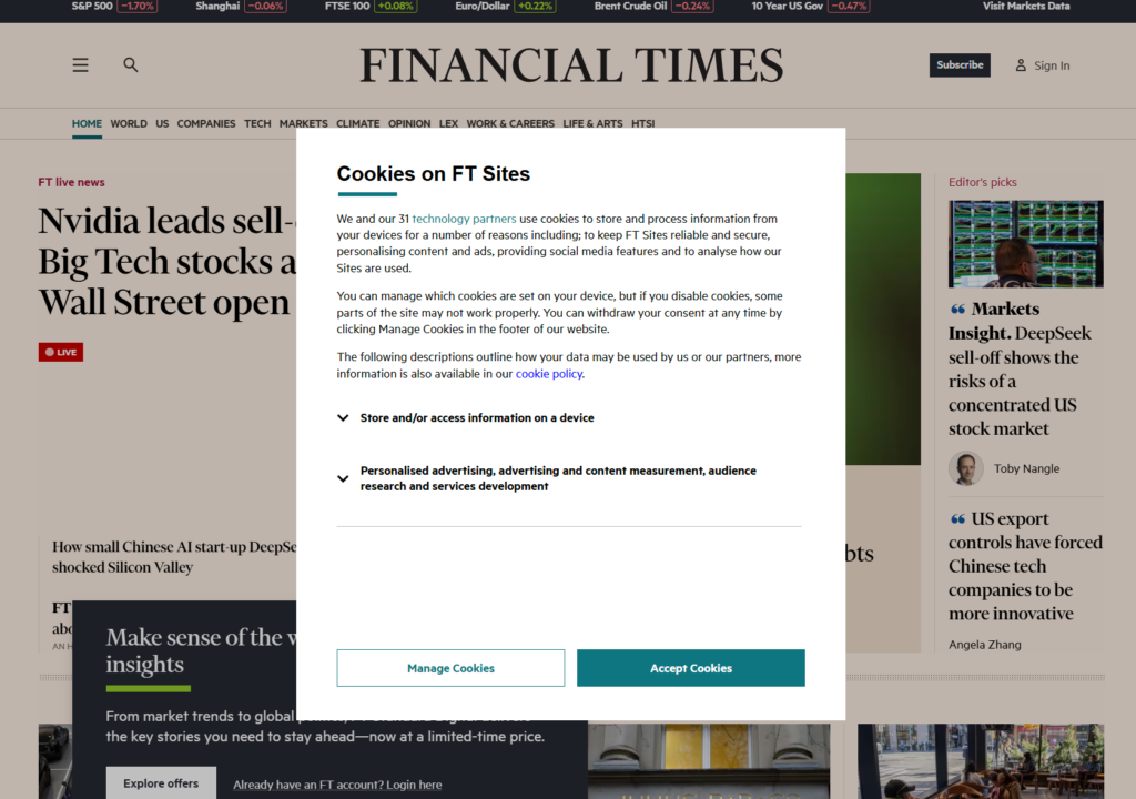
Modal: Full-Page Focus for Critical Tasks

Modals are where things get serious. As someone who’s often developed complex e-commerce solutions, I know how critical modals can be for decision-making moments. They’re the go-to UI element when the user must focus entirely on a single task or message.
Key Features:
- Appearance: A large, often centered overlay that dims the background.
- Trigger: Typically triggered by actions like submitting a form or confirming a deletion.
- Content: Contains critical alerts, forms, or confirmations.
When to Use Modals:
Modals demand attention and are ideal for:
- Confirming sensitive actions, such as deleting a file or making a payment.
- Displaying forms that require immediate user input.
- Showing important alerts that cannot be ignored.
Example:
When a user attempts to delete an account, a modal might appear with a clear confirmation prompt: “Are you sure you want to delete your account? This action cannot be undone.”
Real-World Applications
Websites That Nail These UI Elements:
- Google Docs: Tooltips explain icons in the toolbar, while modals handle file sharing and deletion confirmations.
- Facebook: Popovers display notifications and settings, while modals manage profile edits and post creation.
- Amazon: Tooltips hint at features like “Save for Later,” popovers showcase product details, and modals confirm purchase actions.
My Approach to Combining These Elements:
In one e-commerce project, I used all three elements strategically:
- Tooltip: Explained filter icons like “Sort by price.”
- Popover: Showed additional filter options without navigating away.
- Modal: Asked for confirmation when a user attempted to place an order.
This thoughtful use of UI elements significantly improved user engagement and satisfaction.
Best Practices for Tooltips, Popovers, and Modals
Tooltips:
- Keep text concise and context-relevant.
- Ensure accessibility by supporting focus and keyboard navigation.
- Avoid overloading users with too many tooltips on one page.
Popovers:
- Make them dismissible with a close button or click outside.
- Keep the design clean and avoid cramming too much content.
- Use them for interactive elements that don’t require full-screen attention.
Modals:
- Reserve them for high-priority actions.
- Always include clear actions like “Cancel” or “Submit.”
- Test for accessibility, ensuring screen readers announce modal content properly.
Conclusion: Empowering User Experiences
After more than a decade of designing and developing websites and running my own web development agency, I’ve learned that small UI details can have a profound impact on user experience. Understanding the differences between tooltips, popovers, and modals—and using them intentionally can elevate your designs and keep users engaged.
Whether you’re guiding users with a tooltip, providing rich interactions with a popover, or demanding attention with a modal, these tools are invaluable. By implementing them thoughtfully, you’ll create interfaces that are both functional and delightful.